A highly customizable action popover for the selected text
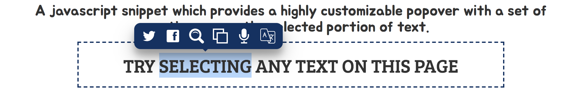
A javascript snippet which provides a highly customizable popover with a set of options, over the selected portion of text.
To get started with Selection.js, download the Script and add it to your project
<script src="text-popover.min.js"></script><script>var popover = new TextPopover();popover.init();</script>
<script src="text-popover.min.js"></script><script>var popover = new TextPopover();popover.configPopoverButtons({ //enables the popover actions (Boolean)facebook: true,twitter: true,search: true,copy: true,speak: true}).configPopover({bgColor: 'crimson', //sets the background color (Hexadecimal color )iconColor: 'white', //sets the icon color (Hexadecimal color)hideArrow: false, //hides the little arrow icon at the bottom of the popover (Boolean)showTooltip: true, //shows the tooltip for each action (Boolean)iconTransition: true, //enables the icon transition (Boolean)popoverShadow: '0 14px 28px rgba(0,0,0,0.25), 0 10px 10px rgba(0,0,0,0.22);' //set the box-shadow css property for the popover (CSS string)}).init();</script>
<script src="text-popover.min.js"></script><script>var customAction = {name: 'save_notes', //name of the actiontooltip: 'Save_Notes', //currently only single word tooltip is supportedcustom_attr: 'other details', //you can add any number of custom attributesicon: `<i class="far fa-edit text_popover_icon"></i>`, // you can use fontawesome or other icons or you can paste the icon's svg string directly. You just have to add the 'text_popover_icon' class. In some cases, the icon might not be formatted correctly. So you have debug and add appropriate styles.handlerFn: function () {console.log(this.selectedText); //stores the selected text.console.log(this.save_notes.custom_attr); //this.[customAction.name] refers to customAction object.//code to save the selected text for the userreturn false;}};var popover = new TextPopover();popover.addPopoverButton(customAction).init();</script>