Simple declarative API for rendering Material UI Dialogs
Simple declarative API for rendering Material UI Dialogs written in TypeScript
react-mui-dialog was written while building a learning portal website. With around ~15 unique Dialogs, it became obvious that many of the dialogs shared much of the same structure and that we could configure and reuse the same components through a single extensible API.
npm install react-mui-dialog --save
Note: react-mui-dialog (as the name suggests) assumes that you’re using react, specifically version >= 16.8, and material-ui.
Checkout the codesandbox for working examples.
In a nutshell there are 3 objects to know about.
DialogProvider - to be included near the root of the tree.useDialog - the hook associated with the provider.openDialog - The function which will configure, open, and handle the dialog.To start, wrap your app (or some part of the subtree) in the provider, something like:
// file: App.tsximport * as React from "react";import { DialogProvider } from "react-mui-dialog";import { ThemeProvider } from "@material-ui/core";// ...export const App = () => {// ...return (<ThemeProvider><DialogProvider>{/* ---------- other components ---------- */}</DialogProvider></ThemeProvider>);};
Note: If you’re using Material UI’s ThemeProvider you probably want the DialogProvider to be a child of that component.
Then in a nested component, hook into the dialog context. For example, let’s create a button that will show the user a notification:
// file: NotificationButton.tsximport * as React from "react";import { useDialog } from "react-mui-dialog";export const NotificationButton = () => {const { openDialog } = useDialog();// ...};
Now inside of the nested component we can configure and open up the dialog in response to a user action (in this case after clicking a button) by using the openDialog function provided through the hook.
In the simplest case we show the user a dialog with a title, some text, and a button to dismiss the dialog (so, no cancel button, just a “submit” button letting us know that the user moved on past the dialog). An example might be delivering some kind of notification to a user, say when a user first logs into a site after some time and a dialog pops up to tell them about new features.
Continuing the snippet above:
// file: NotificationButton.tsximport * as React from "react";import { Button } from "@material-ui/core";import { useDialog } from "react-mui-dialog";export const NotificationButton = () => {const { openDialog } = useDialog();const handleClick = () =>openDialog({// set the dialog's titletitle: "There's change in the Air!",// include some text to show the user, NOTE: this could be any arbitrary// component, not just a string.contentText: "Here's what's new in version 2.0 ...",// don't render the cancel button, because in this case the only thing a// user can do is "dismiss" the notification.cancelButton: false,// configure the submit button. MUI defaults to text buttons, let's// use a contained button styled with the theme's primary colorsubmitButton: {children: "Dismiss", // <-- the button textprops: {variant: "contained",color: "primary",},},// onSubmit is the action we take when the user "accepts" whatever// the dialog is prompting them about. the function must return a// promise, and since no fields have been defined (in this particular// case), all we need to know is _that_ the user clicked the submit// (dismiss) button.onSubmit: async () => alert("The user dismissed this notification."),});return (<Button variant="contained" color="primary" onClick={handleClick}>Show Notification</Button>);};
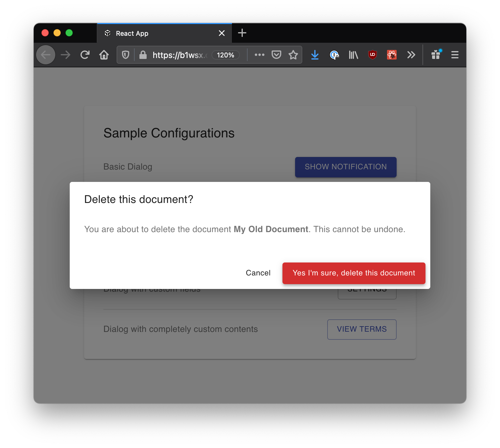
This dialog config would yield something like:

And there we go, we can render this button somewhere in our app and can show the user a basic dialog.
Before getting into the examples it’s worth touching on the general structure of a dialog that this package assumes. Basically, a dialog is viewed as just a fancy form which under the right conditions is configured and subsequently shown to a user as an overlay over the current page content.
Just taking a quick looks at the components which “make-up” a dialog as defined by the material-ui package we see a general structure:
This package imposes additional assumed structure on the contents of Dialog, the most important aspect being: every dialog is a form.
What about a dialog with a title, some short text, and a button to close the dialog (something like the notification example above)? This can be viewed as a “trivial form”, basically just a submit button.
The question might then be, why not just use a button instead of a “trivial form”, and the answer is that dialogs are purposefully interruptive requiring the user to take additional action. For example, a dialog which is presented to the user before deleting a document. The fact that the user simply submitted our “trivial form” is enough for us to know that we should carry on with the associated action.
With this in mind. This package assumes the following sturcture in addition to material-ui’s Title, Content, Actions sections. Each Dialog (form), has:
The section outlines some (most) of the available configuration that can be passed to calls to openDialog.
A working codesandbox is available here. The code in the sandbox can also be viewed on github here.
We can customize the cancel and submit buttons which are shown to the user:
// elsewhere ...import { Typography } from "@material-ui/core";// ...const { openDialog, closeDialog } = useDialog();// ^^^^^^^^^^^// ...openDialog({title: "Delete this document?",// a component this timecontentText: (<Typography color="textSecondary">You are about to delete the document <b>{docName}</b>. This cannot beundone.</Typography>),// In this case we'll pass our own button components.// NOTE: Because we're passing our own component we have to// handle closing the dialog when we click cancelcancelButton: {component: <CustomButton onClick={closeDialog}>Cancel</CustomButton>,},// NOTE: make sure to set type='submit' for the submit buttonsubmitButton: {component: (<HighEmphasisCustomButton type="submit" variant="contained">Yes I'm sure, delete this document</HighEmphasisCustomButton>),},onSubmit: async () =>alert(`Deleting document name [${docName}] with ID [${docId}]`),});
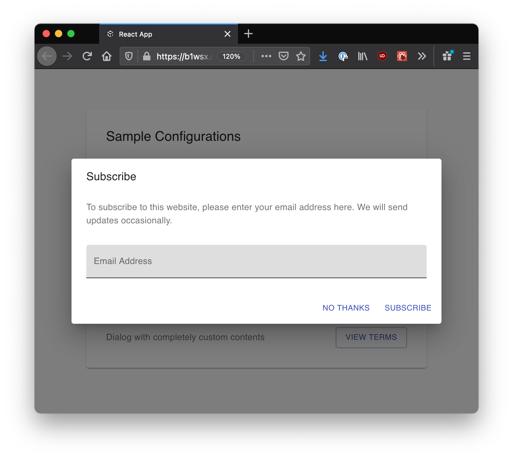
By default you can easily add-in (text) fields. If you require other types of fields consult the example after this one. Importantly, this package uses formik under the hood, if you’re familiar with formik then some of the nomenclature should sound familiar.
// elsewhere ...import * as Yup from "yup";// ...const { openDialog } = useDialog();// ...openDialog({title: "Subscribe",contentText:"To subscribe to this website, please enter your email address here. We will send updates occasionally.",// Render formik fields in the dialog by specifying fields (below), each// key is used as the name of a field in the formik form. There is// a 1:1 mapping between the keys below and fields in the form.fields: {emailAddress: {// behind the scenes this packages gathers all the initialValue// values found in this "fields" object, constructs an// 'initialValues' object and passes that to the <Formik ></Formik> componentinitialValue: "",// for convenience we could omit 'label' and react-mui-dialog would use this// field's name for the labellabel: "Email Address",// These props are passed directly to the underlying// formik <Field ></Field> component.fieldProps: { variant: "filled" },},},// optional validationSchema, defined just as you would with// formik, used to validate the fields.validationSchema: Yup.object({emailAddress: Yup.string().required("This field is required").email("Must be a valid email"),}),cancelButton: { children: "No Thanks" },submitButton: { children: "Subscribe" },// the keys of the fields object (above) are how you reference// values received by the form (as is typical with formik)onSubmit: async ({ emailAddress }) =>alert(`Added email [${emailAddress}] to the mailing list!`),});
This config would result in something like:
For more control over the fields which are rendered, or if we simply want something other than text fields, we can pass formik <Field ></Field> components directory to openDialog.
Note: this is a heavily truncated example, check out the codesandbox for a working example.
// elsewhere ...import * as Yup from "yup";import { CheckboxWithLabel, Select } from "formik-material-ui";import { FormControl, InputLabel, MenuItem } from "@material-ui/core";import { Field } from "formik";// ...const user = getUserProfile();// ...openDialog({title: "Profile Settings",contentText: null,fields: {username: {initialValue: user.username,// NOTE: we omit passing a label},// here we render something other than a text field by modifying// the props that are passed to the formik <Field ></Field> component.onMailingList: {initialValue: user.onMailingList,fieldProps: {component: CheckboxWithLabel,type: "checkbox",Label: { label: "Receive newsletter" },},},// Here we pass our own component, if [fieldName].component is// specified then this component will be rendered and// [fieldName].fieldProps will be ignored.notificationRetention: {initialValue: user.notificationRetention,component: (<FormControl><InputLabel htmlFor="notificationRetention">Keep notifications for</InputLabel><Fieldcomponent={Select}name="notificationRetention"inputProps={{id: "notificationRetention",}}><MenuItem value={"1_week"}>1 Week</MenuItem><MenuItem value={"2_weeks"}>2 Weeks</MenuItem><MenuItem value={"1_month"}>1 Month</MenuItem></Field></FormControl>),},},validationSchema: Yup.object({username: Yup.string().required("username cannot be empty"),onMailingList: Yup.boolean(),notificationRetention: Yup.string(),}),cancelButton: { children: "Close" },submitButton: {children: "Save",props: { variant: "contained", color: "secondary" },},onSubmit: async ({ username, onMailingList, notificationRetention }) =>alert(`Saving settings Username [${username}], Receive newsletter [${onMailingList}], Keep notifications for [${notificationRetention}]`),});
This config would yeild something like:

Finally if you just want something completely custom you can override the entire contents of the dialog for something that suits your needs:
Let’s make ourselves a custom form. Note this component has nothing to do with react-mui-dialog:
const CustomForm: React.FC<{ onCancel: () => void) }> = ({ onCancel }) => {const [state, setState] = React.useState({email: "email@domain.com",terms: false,mailing: true,});const handleTextChange = (e: React.ChangeEvent<HTMLInputElement>) => {setState({ ...state, [e.target.name]: e.target.value });};const handleCheckChange = (e: React.ChangeEvent<HTMLInputElement>) => {setState({ ...state, [e.target.name]: e.target.checked });};const handleSubmit = (e: React.FormEvent) => {e.preventDefault();alert(`Email [${state.email}] with answers to terms [${state.terms}] and mailing [${state.mailing}]`);onCancel();};return (<formonSubmit={handleSubmit}style={{display: "flex",flexDirection: "column",alignItems: "start",gap: "16px",padding: "16px",}}><Typography variant="h6">Terms & Privacy</Typography><Typography color="textSecondary">We've updated our terms ...</Typography><TextFieldtype="email"name="email"label={"Updated Email"}variant="filled"fullWidthrequiredvalue={state.email}onChange={handleTextChange}></TextField><div style={{ display: "flex", alignItems: "center" }}><FormControlLabelcontrol={<Checkboxname="terms"checked={state.terms}requiredonChange={handleCheckChange}></FormControlLabel>}label="Accept Terms"/><FormControlLabelcontrol={<Checkboxname="mailing"checked={state.mailing}onChange={handleCheckChange}></FormControlLabel>}label="Receive newsletter"/></div><div style={{ alignSelf: "end", display: "flex", gap: "16px" }}><Button onClick={onCancel}>Cancel</Button><Button variant="contained" type="submit">Udpate</Button></div></form>);};
And then let’s pass this component to react-mui-dialog to handle displaying it to the user:
// elsewhere ...const { openDialog, closeDialog } = useDialog();// ...openDialog({customContent: <CustomForm onCancel={closeDialog} ></CustomForm>,});
Which would yield something like:
