Tool for creating native-like KaiOS UI.
Tool for creating native-like KaiOS UI.
Include the checkboxes-radios folder, CSS and JS files into your project.
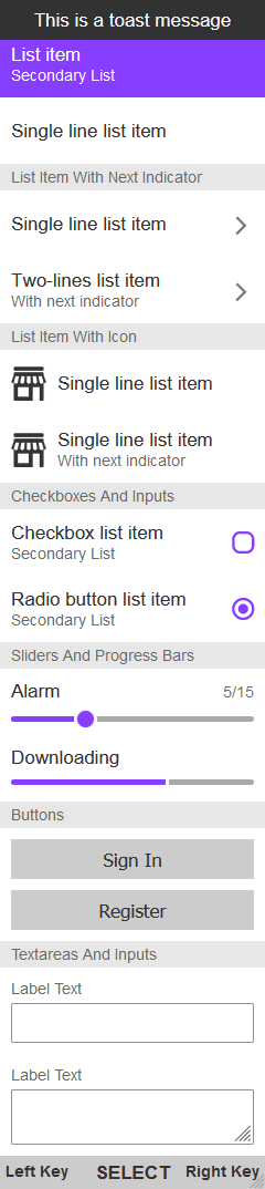
<body><div id="app"><div id="header">header</div><div class="toast">This is a toast message</div><div id="content"><!-- add all content of the app in here --></div><div class="softkeys"><div class="softkey softkey-left">left key</div><div class="softkey softkey-center">select</div><div class="softkey softkey-right">right key</div></div></div></body>
<div class="list-item focusable" tabindex="0"><p class="list-item__text">single line list item</p></div><div class="list-item focusable" tabindex="0"><p class="list-item__text">list item</p><p class="list-item__subtext">secondary List</p></div>
<div class="list-item-indicator focusable" tabindex="0"><p class="list-item-indicator__text">single line list item</p><span class="list-item-indicator__indicator"></span></div><div class="list-item-indicator focusable" tabindex="0"><p class="list-item-indicator__text">two-lines list item</p><p class="list-item-indicator__subtext">with next indicator</p><span class="list-item-indicator__indicator"></span></div>
<div class="list-item-icon focusable" tabindex="0"><img src="" alt="" class="list-item-icon__icon" /><div class="list-item-icon__text-container"><p class="list-item-icon__text">single line list item</p></div></div><div class="list-item-icon focusable" tabindex="0"><img src="" alt="" class="list-item-icon__icon" /><div class="list-item-icon__text-container"><p class="list-item-icon__text">single line list item</p><p class="list-item-icon__subtext">with next indicator</p></div></div>
<div class="checkbox-container"><p class="checkbox-container__text">checkbox list item</p><p class="checkbox-container__subtext">secondary List</p><inputtype="checkbox"tabindex="0"class="focusable checkbox-container__input"/><div class="checkbox-container__checkbox"></div></div>
Note: you can change checkbox apperance in CSS, simply navigate to the checkbox-container__checkbox class in the CSS file and provide path to other image.
<div class="radio-container"><p class="radio-container__text">radio button list item</p><p class="radio-container__subtext">secondary List</p><input type="radio" tabindex="0" class="focusable radio-container__input" /><div class="radio-container__radio"></div></div>
Note: you can change radio apperance in CSS, simply navigate to the radio-container__radio class in the CSS file and provide path to other image.
<div class="slider-container"><p class="slider-container__text">alarm</p><p class="slider-container__subtext">5/15</p><inputtype="range"tabindex="0"min="1"max="15"value="5"class="slider-container__slider focusable"/></div>
<div class="progress-container" tabindex="0"><label class="progress-container__label"> downloading </label><progressvalue="65"max="100"class="progress-container__progress focusable"></progress></div>
Note: make sure to add progress-container__progress--min class to the progress element upon reaching minimal value and progress-container__progress--max upon reaching maximal value. Otherwise the progress bar will not look as expected #6.
<div class="input-container"><label class="input-container__label">label text</label><input type="text" tabindex="0" class="input-container__input focusable" /></div>
```html