Mobile friendly datetime picker for Vue. Supports date and datetime modes, i18n and more.
🚨 THIS PROJECT IS NO LONGER MAINTAINED 🚨 read more


Mobile friendly datetime picker for Vue. Supports date, datetime and time modes, i18n and more.
yarn add luxon vue-datetime weekstart
Or
npm install --save luxon vue-datetime weekstart
weekstart is optional, is used to get the first day of the week.
import Vue from 'vue'import { Datetime } from 'vue-datetime'// You need a specific loader for CSS filesimport 'vue-datetime/dist/vue-datetime.css'Vue.use(Datetime)
import { Datetime } from 'vue-datetime';Vue.component('datetime', Datetime);
import { Datetime } from 'vue-datetime';Vue.extend({template: '...',components: {datetime: Datetime}});
Download vue, luxon, weekstart and vue-datetime or use a CDN like unpkg.
<link rel="stylesheet" href="vue-datetime.css"></link><script src="vue.js"></script><script src="luxon.js"></script><script src="weekstart.js"></script><script src="vue-datetime.js"></script>
The component registers itself automatically as <datetime>. If you want to use a different name then register it explicitly:
Vue.component('vue-datetime', window.VueDatetime.Datetime);
weekstart is optional, is used to get the first day of the week.
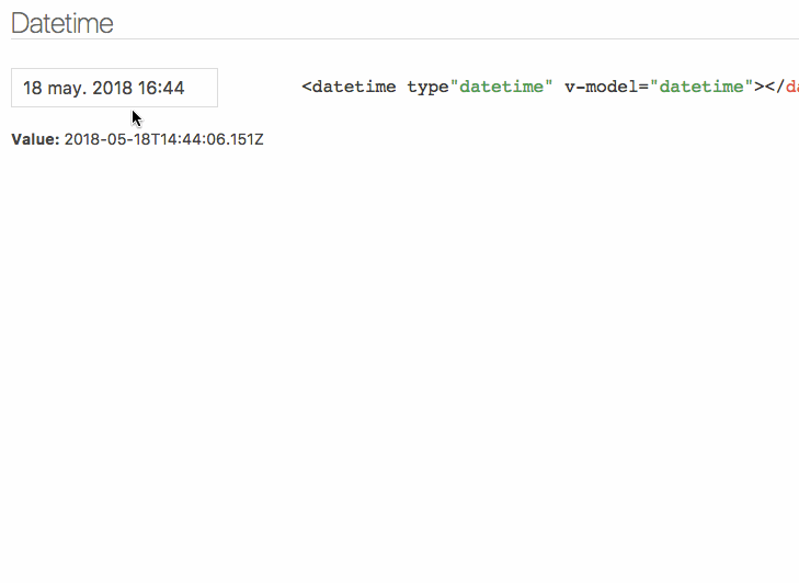
<datetime v-model="date"></datetime>
| Parameter | Type | Default | Description |
|---|---|---|---|
| v-model (required) | ISO 8601 String |
- | Datetime. |
| type | String |
date |
Picker type: date, datetime or time. |
| input-id | String |
'' |
Id for the input. |
| input-class | String, Array or Object |
'' |
Class for the input. |
| input-style | String, Array or Object |
'' |
Style for the input. |
| hidden-name | String |
null |
Name for hidden input with raw value. See #51. |
| value-zone | String |
UTC |
Time zone for the value. |
| zone | String |
local |
Time zone for the picker. |
| format | Object or String |
DateTime.DATE_MED, DateTime.DATETIME_MED or DateTime.TIME_24_SIMPLE |
Input date format. Luxon presets or tokens. |
| phrases | Object |
{ok: 'Ok', cancel: 'Cancel'} |
Phrases. |
| use12-hour | Boolean |
false |
Display 12 hour (AM/PM) mode |
| hour-step | Number |
1 |
Hour step. |
| minute-step | Number |
1 |
Minute step. |
| min-datetime | ISO 8601 String |
null |
Minimum datetime. |
| max-datetime | ISO 8601 String |
null |
Maximum datetime. |
| auto | Boolean |
false |
Auto continue/close on select. |
| week-start | Number |
auto from locale if weekstart is available or 1 |
First day of the week. 1 is Monday and 7 is Sunday. |
| flow | Array |
Depends of type | Customize steps flow, steps available: time, date, month, year. Example: [‘year’, ‘date’, ‘time’] |
| title | String |
'' |
Popup title. |
| hide-backdrop | Boolean |
false |
Show/Hide backdrop. |
| backdrop-click | Boolean |
true |
Enable/Disable backdrop click to cancel (outside click). |
Input inherits all props not defined above but style and class will be inherited by root element. See inheritAttrs option
The component is based on Luxon, check out documentation to set time zones and format.
Date internationalization depends on luxon. Set the default locale.
import { Settings } from 'luxon'Settings.defaultLocale = 'es'
Component emits the input event to work with v-model. More info.
close event is emitted when the popup closes.
Also, input text inherits all component events.
You can customize the component using named slots.
Available slots: before, after, button-cancel and button-confirm
<datetime v-model="date" input-id="startDate"><label for="startDate" slot="before">Field Label</label><span class="description" slot="after">The field description</span><template slot="button-cancel"><fa :icon="['far', 'times']"></fa>Cancel</template><template slot="button-confirm"><fa :icon="['fas', 'check-circle']"></fa>Confirm</template></datetime>
You can also use slot-scope to determine which view is currently active:
<template slot="button-confirm" slot-scope="scope"><span v-if='scope.step === "date"'>Next <i class='fas fa-arrow-right' ></i></span><span v-else><i class='fas fa-check-circle' ></i> Publish</span></template>
Theming is supported by overwriting CSS classes.
yarn test
yarn dev
Bundle the js and css to the dist folder:
yarn build