This is react native accordion for those who wanted to style accordion according to there requirements.
Simple Stylish React Native Accordion
$ npm install react-native-stylish-accordion
or
$ yarn add react-native-stylish-accordion
Now we need to install react-native-reanimated and react-native-animatable.
If you are using Expo, to ensure that you get the compatible versions of the libraries, run:
expo install react-native-reanimated react-native-gesture-handler react-native-redash
If you are not using Expo, run the following:
yarn add react-native-reanimated react-native-gesture-handler react-native-redash
This is created with the help of “react-native-accordion-view” package.
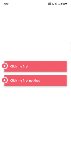
import StylishAccordion from 'react-native-stylish-accordion'export default function App() {const [firstOpen, setFirstOpen] = useState(false);const [secondOpen, setSecondOpen] = useState(false);return (<View style={styles.container}><StylishAccordionopen={firstOpen}title="Click me first"onPress={() => setFirstOpen(!firstOpen)}titleStyle={{ fontSize: 18, fontWeight: "bold" }}headerStyle={[styles.accordionHeader]}subContainerStyle={[styles.accordionSubContainer]}timingTransition={150}iconSize={14}><View><Text>You clicked me thanks for testing this package, this is my first package, do give it a start in GitHub</Text></View></StylishAccordion><StylishAccordionopen={secondOpen}title="Click me first not that"onPress={() => setSecondOpen(!secondOpen)}titleStyle={{ fontSize: 18, fontWeight: "bold" }}headerStyle={[styles.accordionHeader]}subContainerStyle={[styles.accordionSubContainer]}timingTransition={150}iconSize={14}><View><Text>You clicked me thanks for testing this package, this is my first package, do give it a start in GitHub</Text></View></StylishAccordion></View>);}const styles = StyleSheet.create({container: {flex: 1,backgroundColor: '#fff',alignItems: 'center',justifyContent: 'center',},accordionHeader: {backgroundColor: "#ff9d9d",borderTopLeftRadius: 12,borderTopRightRadius: 12,marginLeft: 5,marginRight: 5,marginBottom: 10,shadowColor: '#000',shadowOffset: { width: 0, height: 2 },shadowOpacity: 0.8,shadowRadius: 2,elevation: 8,},accordionSubContainer: {backgroundColor: "#fff",marginLeft: 5,marginRight: 5,shadowColor: '#000',shadowOffset: { width: 0, height: 2 },shadowOpacity: 0.8,shadowRadius: 2,elevation: 8,marginBottom: 13,},});